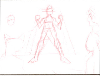
After initial sketching of characters, I went through the story and sketched out rough storyboard images.
To get around my earlier two perceived problems of proportion and consistency, I modeled the characters, ships and environments in rough 3d and posed each shot. Lighting and camera set up probably took the longest to get right, and then I rendered out each shot.
Next I took the rendered images into Sketchbook Pro and "traced" over them.
Then I added the grayscale "color", restricting myself to 16 colors. Gradations looked terrible in 16 colors because there's banding or dithering of some kind. So I stuck with solid blocks of color.
Maybe not the best way to go about it, but it was interesting. :)


1 comment:
cool man!
Post a Comment